

 Editor's Desk




Most comic book fans have a solid idea about what they’re going to buy every week as they descend upon their local comic shop. With that said, there’s still a lot of fun to be had just glancing at the week’s new releases and taking a chance on a book that looks promising, funny, scary, etc. That’s where covers come in. A fantastic image can make the difference between trying something new or saying, “Nah, not this week.”
In that spirit, here are the covers that captured our attention this week, with entries from comics editor Chris Coplan. This is Judging by the Cover.
Punisher #8
Cover by David Marquez and Guru-eFX

This cover is everything I admire about comics. Not another instance to needlessly mutilate Deadpool. Or even what I imagine has to be the 1,273rd meeting between the Merc with a Mouth and Frank Castle. No, it’s that the “logic” of this medium ensures that this egregious display of violence makes total, perfect sense. It’s Wade’s healing that keeps him alive, and that any pesky blood or internal organs won’t bother the “shot.” (Although this cover would be 1,000 times cooler with all that hot, dripping gore post-bullet storm.) From there, it’s clearly some kind of peak human physicality and prowess that makes Frank even capable of such jaw-dropping aim. (If you can do this on, like, a pig corpse, I’ll pay you $1,000.) Mostly, though, it’s the overarching dynamic of this very medium — its balance of maturity and idiocy — that makes this Looney Tunes ass moment prove both silly and totes cool. Because it’s not always about novelty or even being especially deep, technically impressive etc.; no, it’s about leaning into what makes comics this kooky crockpot of ideas, energies, and artistic capabilities. Do they give shooting awards to bonkers vigilantes?
Batman: Bad Seeds – Gotham Central #1
Variant cover by Martin Simmonds

This feels like something of a test for Martin Simmonds. Not that he’s already one of the most impressive and emotionally resonant artists working today. Rather, a lot of his covers/variants tend to feel more “abstract,” as if they’re the manifestation of big feelings as opposed to being an actual scene/event. (And that’s great and all because that’s what a worthwhile cover ought to represent: some encapsulation of a broader, bigger story.) But this time around, Simmonds is basically capturing a day-in-the-life of a Gotham subway car amid the Bad Seeds “saga.” And what’s not to love: Simmonds still plays around with spacing and size to remind us that something is off; the plant-based horrors have both a cooling presence and seem to go on and on forever; and the passengers seem utterly feckless (a neat if not slightly overdone bit of commentary). Sure, it fits the feel and vibes of this event, but it’s always terror done the Simmonds way — which is to say, in a way that drops you into something that you discover, and the fear builds in your own mind slowly and painfully until it’s almost too much. This event is clearly still germinating, but this poison rose is lethal in its effectiveness.
Chachu #2
Cover by Marianna Ignazzi

If you missed Chachu #1, here’s what you need to know: A young girl named Leila and her estranged uncle (the titular Chachu) are looking for the latter’s missing wife (that’d be her aunt, FYI). In this issue, they’re on their way to Las Vegas, and the solicitation asks if “their discoveries pull them closer together… or push them apart at the worst possible time?” And what better way to begin to dissect this dynamic than with the issue #2 main cover from series artist Marianna Ignazzi. The distinction between the pair couldn’t be more clear: With the book set in mid-1979, Leila is the very definition of Penny Lane-ian cool, a paragon of stylish detachment that will define most of the next 50-ish yeats. Chachu, meanwhile, is seemingly stuck (in the past, in his head, etc.), and he can’t seem to see the truth of the situation even when it’s seated directly across from him. The one thing uniting these two? No, not an early grave from smoking — it’s that they only have each other, and they’ll have to find the language, courage, and joy to make this ineffective family unit actually work out (lest their mission goes unfulfilled). Guess the special in this diner is a side of heartache.
The Karman Blade #1
Variant cover by Ian Betram

Between my advanced review and my recent convo with writer Darcy Van Poelgeest, one thing is abundantly clear about The Karman Blade: Artist Ian Bertram is on an entirely new level. I could’ve just as easily highlighted some of Bertram’s other issue #1 covers as examples of the unwavering skill, intensity, passion, and general genius that makes this dark fantasy tale feel so darn special. Yet I went ahead and chose this slightly more abstract offering from the generally more “put together” Bertram. On the one hand, it sort of scares me, and that feels like the best emotion to highlight with any new book. It’s also a bit of a feat in terms of skill and planning, which feels indicative of what I think Bertram really offers as an artist (that overt, undeniable presence, truly). But mostly, this cover captures so much of the book’s core without actually saying it, like the unknowable qualities of our lead, Anatta, and how it’s always perspective that defines someone as either man or monster. It’s a cover that’s hard to grapple with, but it’s also so unassuming in its intent to confront the viewer. In that way, it’s proof that Bertram continues to grow and soar as an effective artist unlike few others.
Six of Us #1
Cover by Gabriel Hernández Walta

Six of Us asks the question, “What if, like, Ross died in the middle of an episode?” OK, it’s a little different and more involved than that, but at the end of the day, the Tom King-penned miniseries is described as a “a story about grief, ambition, and the lies we tell to keep the show alive.” And series/cover artist Gabriel Hernández Walta really steps up and delivers broadcast gold with issue #1’s main cover. The gag itself is not only quite funny, but it feels so perfectly understated, expanding this from a satire/spoof of just Friends to include shows like Seinfeld and even The Drew Carey Show (and that only deepens and extends the book’s thematic power). But aside from that, I love that I already feel some time of way about the characters; even just in one simple image, their personalities and interpersonal dynamics feel quite clear, and that means I get into the work of the story before even cracking the cover. Mostly, though, I love that there’s that awkwardness and disconnect, as if this happened in the worst sitcom you could ever imagine. It drives home the mix of fantasy and reality that will define this story, and make clear that you can dissect as much as you uplift a thing. Based on this cover, I say, “Six seasons and a movie!”
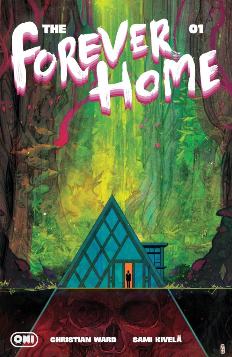
The Forever Home #1
Cover by Christian Ward

It feels like I’ve been staring at this Christian Ward cover for The Forever Home #1 for an eternity. That just goes to show that even as Ward mostly mostly operates as a writer these days, he can still whip up a piece that plants itself directly into your brain like a million rows of tract homes. But it’s more than his skill and vision that draws me back to this cover with increasingly frequency. In a story where rich jerks ride out the end of the world in a home where “only 20 minutes pass for every year on the outside,” this cover nails the subtext and ample horror of that very premise with maximum precision. But I don’t just see this story play out with this cover. I think about homes, and what they real do for us and the way we connect them to our lives and families. I think about how being saved and being damned is basically the difference between one sturdy wall, and what that might really mean. I think about the smallness of it all, and maybe we’re all trapped in something so much more harrowing and complex than even this story’s implications. Mostly, though, I think about how it’s all so beautiful and wonderful and also so deeply, deeply unsettling and scary. I can’t imagine what I’ll feel like when I move from the cover to the story, but I have a sense that maybe I’m not fully prepared for the journey.
Black Cat #14
Cover by Josemaria Casanovas

Admittedly, a cat burglar shouldn’t go in to space and fight evil space gods. Thankfully, Marvel is doing it anyway as Black Cat is right in the thick of Queen in Black, with her one-of-a-kind stealing capabilities basically being positioned as the only way to topple Knull, etc. Now, do I think this absolutely wonderful variant cover is somehow indicative of what space travel might actually be like for Black Cat? I don’t think so — not only do I assume patent black leather won’t survive the depths of space, but exposing one’s skin (no matter how stylish it might appear) is always a no-no for space walks. But, then, that’s the point: You’ve got Black Cat gallivanting around like an even sexier Barbarella, likely mowing down Symbiotes with her Atomic Laser Revolver or whatever. None of this is supposed to be a “real” thing, and the overt ridiculousness of her entire participation is right up there with taking seriously some kitschy romance novel. You’re supposed to yuck it up a bit and really have some fun with it, and to embrace the fact that a cat burglar in space is a dumb idea but also one that’s endlessly fun and weird and flirty to boot. If you can’t get behind this very simple image, then maybe you can’t get the most out of this event. Remember: in space, everyone can hear you “meow.”
Emperor Aquaman #21
Cover by John Timms

Hey, I can’t think of a better way to promote your event/storyline called “Tidal War” then by featuring the biggest dang tidal wave this side of any actual ocean. Normally this kind of heavy-handed, semi-painful deliberateness might annoy or otherwise irk me, but here I sort of love it. Maybe it’s that it comes right after a similarly ridiculous Black Cat cover (they even kinda share shades/hues of green!), and that if we’re really going to embrace the power of these extended arcs and events, we need to really be unafraid in going for the obvious charm and action-heavy art and sequences. And in the fact that artist John Timms displays some real skill in building a generally believable 500-foot-tall wave, and my enjoyment is somehow taken up a few notches. But you know what the truly great part about this cover is (even more than it “washing over” the logo)? Way at the bottom we find Aquaman and Mera posed in a way that’s not as brave as you’d expect but perhaps more sensual and compelling. As if they’re both not sure about what will come (I mean, aside from a wall of water), and they choose to lean on one another for strength and courage. It’s a deeply, deeply human moment in a cover that didn’t need to do that to get over so well.
Star Trek: 60th Anniversary Special #1
Variant cover by Michael Allred

I often try to find some vital reason to highlight one cover or variant cover over another. In the case of this Star Trek one-shot celebrating both the series at large and the air date of the very first episode (September 8, 1966), I don’t really have a reason for selecting this Michael Allred piece. I suppose it’s because I just love almost anything Allred does, and to see his singular magic applied to the mighty Star Trek feels like a way to both dissect and further romanticize this sci-fi series unlike any other. That his choice to balance the old-school series with the relaunched movies is a simple but potent idea, and it tells us everything we need to know about how this series has evolved. (Things change, we double down on some things, and the world is generally more entertained and informed for that very dynamic.) Heck, it could just be that I like the way Allred draws sexy aliens, or that this cover is foil, and that little editorial choice makes this piece shimmer on so many levels. But at the end of the day, there’s no real reason beyond it just stands out, and it speaks to me about this huge franchise that is so deeply ingrained in our subconscious that it’s often hard to really describe what it means and what it still does 60 years later. It’s a show that’s about so much more than any one thing, and that it continues to speak to us about the value of seeking out new things to affirm our very existence. Hey, maybe all that’s reason enough, yeah?

News reported through various sources and compiled with AI. This is automatically generated news content from known, popular, and reliable sources available at the time of publication.
We do not take any responsibility for, nor make any representations regarding, the accuracy, completeness, credibility, or
reliability of the content.
In case of any discrepancy, error, or copyright claim, we will promptly review and remove the content in question where appropriate.
We do not claim ownership of third-party content and assume no responsibility or liability whatsoever for any information contained herein. The credit, links and images are kept intact as an honest gesture, are property of its respective owners.