

 Editor's Desk




Most comic book fans have a solid idea about what they’re going to buy every week as they descend upon their local comic shop. With that said, there’s still a lot of fun to be had just glancing at the week’s new releases and taking a chance on a book that looks promising, funny, scary, etc. That’s where covers come in. A fantastic image can make the difference between trying something new or saying, “Nah, not this week.”
In that spirit, here are the covers that captured our attention this week, with entries from comics editor Chris Coplan. This is Judging by the Cover.
Nightwing #142
Cover by Jorge Fornés

If you’ve been paying attention to this column as of late, Jorge Fornés has been totally killing it with Nightwing covers. Specifically, those covers for issue #137 and #140, which depict a kind of ’70s -nspired, superhero noir as Dick Grayson goes slamming around town on a mission of vengeance/justice. And no superhero spin on an old Charlie Bronson flick would be truly complete without a little vehicular madness. I always love when the car chase itself is minimized to an extent; it makes it feel more stylized and lends an air of distance that I think hearkens back to the days when many of us were crashing toy cars into each other (thus, the elevated excitement at cars going vroom vroom). As a byproduct of that, we get to focus more of extra gritty Nightwing; because it’s so rare, that extra angry mug of his manages to hit even harder, and we almost connect that deeply human emotion to the mighty roar of a high-powered engine. Maybe I just need to rewatch The Taking of Pelham One Two Three or something, but this ongoing saunter through a specific era of storytelling reminds me that some stories remain cool because they’re vehicles for universal ideas and feelings. And, hey, more of the Night-Mobile is never a bad thing, right?
DNX #1
Variant cover by Jim Lee

There’s lots of reasons to be excited by the start of DNX. A star-studded roster of contributors (including Jed McKay and variant covers by Terry Dodson, Whilce Portacio, Ryan Stegman, etc.)? Check. An all-out clash between The X-Men and 3K as the X-Virus is unleashed and the fate of mutantkind is up for grabs? Double check. But mostly I’m jazzed because they managed to get Jim “Hey, I’m A Head Honcho At DC Comics” Lee to bust out a sleek variant cover to issue #1. (Even if said cover is basically a set of ’90s X-Men trading cards.) Because Lee just has this magical approach when it comes to depicting Earth’s mightiest mutants. It’s the hairy forcefulness of an especially muscular Wolverine; the grace and power flowing from every inch of Storm; the blend of beauty and terror that emanates from Angel; and even the way Gambit somehow high-kicks with charisma and charm. Lee just gets what made not only the ’90s X-Men so badass, but how those same elements speak to something deeper about this team. Namely, we’ll always care about their stories not for the stakes or the creators attached or even rampant nostalgia, but rather because we know these people, we’ve seen them fight together, and every new struggle is an affirmation of this connection around all that’s good and just. The fact that this cover makes me feel eight again is just a neat bonus.
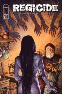
Regicide #2
Variant cover by Pramono Estu

When Image described Regicide as basically being “Dracula meets Berserk,” they were not lying a single, solitary bit. That debut issue saw Patrick Kindlon and Ludovic Lalliat team up for a doubly bloody, triply gritty slice of dark fantasy that would make even Conan the Barbarian fans a little queasy. But as I await the cascade of fresh blood that will likely feature in issue #2, I wanted to pause for a minute and really celebrate this variant cover by Pramono Estu. Because the vibe of this cover (“Lucio Fulci directed a dark and moody film about a haunted witch in 1548 England”) doesn’t entirely vibe with the rest of Regicide. (Even if both this cover and the book share a certain European charm and flavor.) But, hey, that’s cool with me because not only does this slice of mystery prime my brain for the layers of narrative goodness to unfold in issue #2, but there’s something unflinching about this piece. Even if you don’t know exactly what’s going on, you feel the thrill, deep humanity, and overt power of it radiate out from the page into your brain. And Regicide is very much the same: You will feel every inch of it as the book cuts and cleaves through its narrative, and only when you’re caked in blood and sweet will you truly understand it all. If that ain’t good fantasy storytelling, I don’t know what is!
The Patron #2
Variant cover by John Pearson

Let’s forget about what John Pearson is doing inside of The Patron itself and focus for a minute on the narrative forming with his variant covers. I adored the issue #1 B cover because it managed to comment on “the nature of being a working artist;” it then “contextualized our killer in one striking image”; and the patchwork approach was a “great symbol for the murder mystery within.” Ya know, some really thoughtful and compelling uses of art in a story about a murderous art patron. And the issue #2 cover may be even more clever and effective somehow. The different hands (which seemed to be stylistically consistent but depicted in various colors) feel like not only a nod to the many dead artists, but also their continued presence across this story (and how that relates to their artistry). Meanwhile, the missing patron/the patron being “replaced” with a symbol of his murderous aim is interesting — it clearly shows an elevation of the narrative, but also that there’s a kind of depersonalization happening that feels in stark contrast (in a good way) to the nature of an art-centric book. And the pop art spin to our floating murderous hand is quite clever, another thematic layered and also a sharp bit of meta commentary on comics specifically. I can’t wait for issue #3 and the way this “cover story” grows all the more undeniable.
Exquisite Corpses: Fox Mask Killer #1
Variant cover by Warrick Wong

Here’s something that may not surprise you: I have feelings about retailer-specific covers! Do I think it’s a great way to support more artists and local comic shops? Totes McGoats. But do I also think it adds to the increasingly feckless, speculative-heavy tendencies of this industry as a whole? You betcha! But if we can keep great art flowing — like this “Comic Inspiration NYCC 2026″ cover from Warrick Wong — then maybe I can deal with my own “baggage.” I absolutely love the clear homage to flicks like Kill Bill; Exquisite Corpses as a whole proudly wears its influences and faves on its sleeve, and to see that continue here tells me mostly everything I need to know about Fox Mask Killer and my continued expectations. But as far as “yes, and”-ing with said inspiration, Wong spin kicks us squarely in the mug, creating this uneven, slightly jarring angle where everything feels a little unreal and all this stylized violence lands in a decidedly new and interesting manner. I also like that while my eye is initially drawn to Fox, I eventually made my way down to her “victim”; that to me is the face of a man who is either jazzed about being decapitated or he’s got something else up his sleeve (hopefully it’s a second head). I could go on and on about the commerce-art “dynamic,” but it’s pretty easy to get me to shut up if said art feels as intense, joyous, and generally resonant as this sword soiree.
The Big Shakedown #1
Cover by Scott Koblish

Do you want my unyielding, slightly feverish attention? Just describe your now book as a “sunbaked LA noir in the vein of Chinatown and The Long Goodbye and set in the post-apocalyptic remains of the most beloved/hated city in the world.” And while it remains to be seen if the story proper can deliver, series artist Scott Koblish absolutely does so with his issue #1 main cover. Do I get the vibe of Chinatown and The Long Goodbye? Not exactly — although short of actually featuring the handsome mug of Jake Gittes, that wouldn’t be mostly unachievable. Still, the broken map of L.A. facilitates the same kind of engaged, earnest dissection and commentary on the City of Angels, an observation on its singular nature and how ideas of power/structure, control, and basic humanity exist across all L.A. tales (even those where the world’s already ended). Similarly, I love the understated nature of the “apocalyptic elements”; if you told me this was just a feature of some neighborhood, I’d believe you outright — and that’s maybe the whole point because L.A. is this wild beast that is as unknowable as it is undeniable. (Plus, the slightly subtle quality means this won’t be, like, Escape from L.A. and can be its own commentary on the End Times). If this is the way things truly wind down, it should be one heck of a time either way.
Batman Day 2026: Batman of Two Worlds #1
Cover by Nick Dragotta, Jorge Jiménez, and Frank Martin

If the whole of the comic book industry were a person (and a weird and awkward person that soul would be), they’d be down with a real mean case of Batman Fever. Between Scott Snyder and Nick Dragotta on Absolute Batman, and Matt Fraction and Jorge Jimenez on Batman, the world has been inundated the last year-plus with two very different, very good Batmen (Batmeni?) Now, admittedly, this cover from Dragotta, Jiménez, and Frank Martin doesn’t exactly capture the sheer lightning that’s made these two titles so dang impressive. What it does capture, however, is some key features of this ongoing “sensation.” One Bats is big, bold, and slightly cartoonish, while the other is lean, mean, and decidedly approachable — that distinction tells you everything about why they both work together so dang well as unlikely tag team. Similarly, one Bat is about speed and grace and flexibility, and the other is basically a force of nature — again, that distinction speaks to how we view and interact with these two novel takes of this rather long-lived hero (and how they also manage to tap into certain historical perspectives/traditions of Batman). Maybe the idea of “Batman Day” is a little over-the-top (he’s not Dolly Parton, by god!) Still, books like this prove that Batman continues to be a thing we live and engage with every darn day, and that’s pretty cool.
Absolute Cassandra Cain: The Shadow’s Hand #1
Variant cover by Matías Bergara

On this week’s edition of the AIPT Comics Podcast, Dave “I Love Ladybugs and Old Ham Steaks” Brooke and I raved about a Matías Bergara cover. But while Brookesie and I were mad about A Mischief of Magpies #2, Bergara is also launching a new title this week with Absolute Cassandra Cain: The Shadow’s Hand #1. Spinning out of Absolute Catwoman, we’ll get to see the origins of “the Absolute Universe’s most formidable assassin,” and how that connects with/relates to Joker, the League of Assassins, and Selina Kyle herself. But perhaps the origin is actually right here on Bergara’s own variant cover? Draping herself in these dense, seemingly pulsing shadows would indicate a slightly magical spin, which would be a nice tweak for the AU. Meanwhile, her outfit leans more toward badass assassin war-goddess over the more “street level” vibes of our own Cassandra (I mean, as street level as a trained global killer can be, of course). All in all she feels like a proper badass — and not the “stealth” badass we’re used to — someone who relies on a deep well of dark, ancient power. But even if none of this is true, there’s two things I do already know: 1) this Cass is still a fighter, always swinging from the shadows cause that’s all she knows and 2) she can cut you with a glance before ever swinging a sword. Cass can be anything as long as that strength rings perpetually true.
Ofiusa #1
Variant cover by Guillem March

Here’s something absolutely worth repeating: Almost no one draws pretty girls (really, pretty people) quite like Guillem March. The volumes of his awesome Cover Girls series are proof positive that March uplifts the human form with a devotion and technical prowess that really celebrates beauty in all its splendid, multifaceted glory. And with the forthcoming Ofiusa, March will have ample opportunities to explore the human form further in the story of a saucy love triangle happening on a mystery island “paradise.” And while I could’ve just commented on the book’s main cover (where we get some especially beguiling half nudity at the beach), I instead opted for this fully-clothed variant cover. Because when you understand curves and angles and all that business, you don’t need any nudity to create characters that are this undeniably alluring. Sure, the pose itself might help a bit in generating a little added passion and intensity, but even then, March just has this singular interest in hooking us by making people feel so interesting in ways that are mysterious, emotional, sensual, etc. The lights in the background, meanwhile, add a kind of undefined magic, a rather playful contrast to the way he coaxes us to engage with his very real subjects. I have no doubt that there will be loads of great pinups and whatnot across Ofiusa, but as for a “teaser,” this cover proves that the man just knows how to craft characters that we can’t help but fall for (clothed or not).

News reported through various sources and compiled with AI. This is automatically generated news content from known, popular, and reliable sources available at the time of publication.
We do not take any responsibility for, nor make any representations regarding, the accuracy, completeness, credibility, or
reliability of the content.
In case of any discrepancy, error, or copyright claim, we will promptly review and remove the content in question where appropriate.
We do not claim ownership of third-party content and assume no responsibility or liability whatsoever for any information contained herein. The credit, links and images are kept intact as an honest gesture, are property of its respective owners.