

 Editor's Desk




Most comic book fans have a solid idea about what they’re going to buy every week as they descend upon their local comic shop. With that said, there’s still a lot of fun to be had just glancing at the week’s new releases and taking a chance on a book that looks promising, funny, scary, etc. That’s where covers come in. A fantastic image can make the difference between trying something new or saying, “Nah, not this week.”
In that spirit, here are the covers that captured our attention this week, with entries from comics editor Chris Coplan. This is Judging by the Cover.
The Deadman #4
Cover by Martín Morazzo and Chris O’Halloran

More attentive readers of this column will know that I’m a real dumb guy. More specifically, I tend to have an initial, completely whimsical reaction before the “rest” of my brain react to a piece of art. So, when I saw this cover to The Deadman #4, I instantly thought that it was a giant sword being thrust down from the Heavens into our earthly plane. And, hey, I’m not at all disappointed that it turned out to be an escalator, which is my fourth favorite form of transportation. Plus, it fits with the deeply personal, unwaveringly human angle of this book, and how Boston Brand is basically our very own guide and guru for the death (like the kind you might find in a strip mall, and he’s even wearing a “uniform” of sorts). Rather than feeling dumb about my initial sword take, I then started to think about the “violence” attached to this “commercialization” of death, and how we use this kind of imagery to soften something so unknowingly terrifying. That, and we think if we can control it (like buying a new cellphone at some kiosk), things might go our way. But like an actual sword from God, nothing is ever so easy and predictable when it comes to death. Let this one remind you of that with a little chuckle and something else entirely.
Fantastic Four #16
Cover by Humberto Ramos and Edgar Delgado

I dig a cover that works on a few levels. If all you took away from this was the gag of Reed Richards as the smartest tarp in the world, then I could laugh for 100 hours straight. (I also love the not-so-subtle implication that sometimes the smartest man on Earth’s best value or utility is as a piece of equipment.) But maybe you take it a little further (as I did once I stopped chuckling so hard), and you see the kind of Twilight Zone-ian sheen to this cover. It’s the title and text, and how I can practically hear Rod Serling deliver that line with his warm, mahogany pipes. Or, that the “aliens” seem to look like New Yorkers circa 1928, and the layers of context and meaning that might offer this story. And, sure, it’s not exactly new territory for F4, this kind of playful, vaguely meta commentary on sci-fi stories of the 20th/21st century. However, when we get a moment like this, it just reminds you of what makes this team so special: They work on so many layers, and each one connects with the others while remaining independent. What we really get, then, is a story-based friend, a living commentary, and something that uses its space to get at the big and small mysteries of life. Still, is Tarp Reed water-resistant?
Crowbound #1
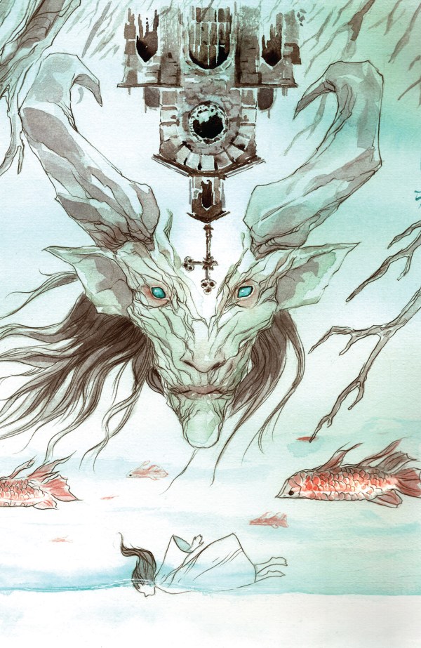
Variant cover by Dustin Nguyen

If you scan the solicitation to Crowbound, it reads like the nerdiest Mad Libs ever. There’s lines like, “Rose isn’t special. She works in the Factory just like everyone else.” Or, that it’s “part post-apocalyptic neo-Western, part southern gothic, part dark fantasy.” Even that it’s “Margaret Atwood’s The Handmaid’s Tale meets Cormac McCarthy’s The Road with echoes of Kill Bill and Pan’s Labyrinth.” But all you really need to sell this book is co-creator Dustin Nguyen’s own variant cover for issue #1. Does it touch on any or all of those gems from the solicitation? Sure, just look at that goat guy’s face and tell me you don’t immediately get flashbacks of this scene. But given the fictional gumbo that this book is trying to serve up to readers, everything feels familiar enough but also out of place, scary in that you can gain your footing but not enough that you’d ever feel confident. Nguyen balances the ethereal and the unnerving in such a way that you can’t look away even if you actually tried to move on. Throw in his general style (passionate and slightly unmoored, as if he’s possessed while drawing this stuff), and it’s the deeply resonant voice and presence that cuts through all of those ideas and influences. In short, shit is hella spooky.
Hellraiser: Resurrections – New Wounds #1
Variant cover by Federico Sabbatini

Back in late July, we told you that Pinhead was coming back with a vengeance. And while that interview with Zac Thompson focused on the painfully relevant story that is The Onanistic Ritual, Mike Costa and Paco Camallonga and get to start it all off with New Wounds #1. The TL;DR is that “the gates of Hell are kicked open when an investigation into the Lament goes sideways in the best/worst ways imaginable” — that feels like a damn solid entry point for a Hellraiser story. And that’s perhaps part of the reason why I gravitated toward this Federico Sabbatini variant cover New Wounds. Short of Leatherface’s chainsaw and Freddy’s gloves and sweater, the Lament Configuration is perhaps horror’s most recognizable “weapon.” The idea of making it so alluring and appealing (seriously, I want to put it on a shelf in my apartment) feels like a way to introduce/re-introduce folks to what it represents in the Hellraiser-verse. It’s so powerful that it almost distracts you from the real terrors of this universe, which hold a particularly grisly hue in the hands of Sabbatini. It’s just proof that what works about this story will always do so, and it matters not the configuration or if you grew up with the series or not, Hellraiser will always speak to everyone. Too bad that often involves telling us that we’re gross flesh dummies who are going to suffer and die.
Sicko #2
Variant cover by ACO

Sure, I clicked with Sicko #1 as a whole, but that main cover from series artist Amilcar Pinna really started the sickness off something proper. In one image, Pinna captured the entirety of the book — this sickening, overly intense examination of modern health (and healthcare systems) as well as the various emotional and cognitive threads that come with exploring disease and dying in 2026. And the power of Sicko is so ineffective, in fact, that ACO keeps the bug rolling with a variant cover to issue #2. Sure, this take feels a little more thrilling and exciting, the overtly comics book version of Pinna’s piece that makes it really seem like Valentine wields human parts like freaky T-Spheres. But what remains is that overwhelmingly personal, in-your-face feel of this all; it’s smashing you about the face with blood and sickness and suffering in a way that, while perhaps more shiny and stylized, is ultimately just as effective in getting us to consider these big themes. It reminds me of doctor’s offices that are bright and shiny and have, like, toy trains and video games; it’s all sort of a ruse to get you to forget about the complications of actually being alive and managing your health through a system that’s often decidedly less shimmery. If you can’t feel the power of this piece, perhaps check your pulse pronto.
Tales of Wonder #1
Cover by Steve Skroce and Ian Herring

Admittedly, the premise for Tales of Wonder seems overly familiar. Sure, I love the idea of “what if the world’s most popular superheroes came to life” — when I first encountered some version of it in The Indian in the Cupboard. But like a lot of Steve Skroce’s work (see We Stand On Guard), the magic is always in the sublime execution of the vision. Case in point: his main cover to issue #1 (alongside Ian Herring). There’s genuine magic across this entire piece: the meta tinge with what’s clearly a reference to the Bill Finger-Bob Kane “partnership”; the mutated reject from G.I. Joe that I think is a far better direction for the series; our fantasy vixen/sorceress that basically represents Conan and Red Sonja; the mutant fly-dude that I already want starring in a 100-issue series; and, of course, the prerequisite giant bear character. Yes, fictional characters coming to life is old hat, but the life already promised in Tales of Wonder is leaps and bounds more robust and energetic. I’ve never seen most of these creations before, and yet I already feel like I have some deeper connection to each of them just based on how alive and compelling they feel in one “scene.” I’ve heard there’s only, like, nine stories in the whole world, and if this is one of ’em, such playful charm and sheer skill make me nearly forget about this long-standing trope. Does someone want to check on our friend with the gun though?
Marvel Zombies: War Zone #1
Variant cover by Domenico Cava

Don’t get me wrong: I love Marvel Zombies, but I feel like they went overboard with the 1,734 subsequent spin-offs and add-ons. Do I think that putting Frank Castle in the center of the outbreak, and having shoot his way out of zombie hell, will somehow be better/not fall victim to that same derivative tendencies? Sure, I hope so, but it could just be a momentary, extra gory distraction. But as of now, the only thing really giving me any hope for War Zones is this Domenico Cava variant to #1. I absolutely love this more desiccated, fantasy-inspired take on the dead; it feels like they’re ghouls you’d smash in, like, the Dungeon of Elzhagir or something. But they don’t just look cool, and as this horrific Iron Man proves, there’s something extra depressive alongside all the gore and horror. I get the feeling that they’re actually suffering, and that pang of emotion does wanders for my immersion (especially because so much of Marvel Zombies is often more campy and overt). Even Frank looks like he’s at death’s door, and that little nudge of added grief and humanity does so much to make me think a change of setting and focus might unlock something other MZ titles have ignored and/or needlessly underplayed. There’s only one question left: Are they running around/climbing out of the corpse of Galactus or another Marvel giant?
Legion of Super-Heroes #1
Variant cover by Yasmine Putri

Whereas I don’t know the scope/direction of Marvel Zombies, Legion of Super-Heroes is clear in one thing: -ish is about to get very, very depressive. The solicitation not only promises that “superheroes are outlawed” and “worlds at war,” but “tomorrow’s last glimmer of hope, R.J. Brande, has been brutally murdered.” Yeesh, I’ve seen more uplifting outcomes in a Fellini film, amirite?! But things aren’t so bad, as Yasmine Putri effortlessly lifts our spirits with this issue #1 variant. I love that it connects to the Legion’s meta-ish tendencies as a book taking place in the future; it’s a great lens to explore DC stories in an earnest way and connect these heroes in ways that truly matter. From there, the cover does the thing that the best Legion stories always have: remind us of what it is to be young, unsure, and desperate to make a change. Ya know, that fear of our own power as people, and how it feels like such a huge secret until we can find a way to meaningfully share it with the world. (And in this story scenario, it’s also got the upside of being dangerous, and a little rebellion can be a good thing.) The future may be bleak for our young heroes, but not so bleak that a little spark of something else can’t right everything and set about a new world where good people don’t have to live in the dark. Hey, at least there’s still seemingly soda in the future.
Archie #1
Variant cover by Nick Cagnetti

When I interviewed writer Ben H. Winters, he said something really important about Archie. Namely that “we go back to Riverdale for the same reason we go back to Shakespeare – it’s different than wherever and whoever we are, but it speaks to the deep humanness in everyone.” And I was thinking about this very quote when I just so happened to peep this Nick Cagnetti for issue #1. I don’t know how close this take is to the ol’ Bard, but if nothing else, it’s the kind of wild theatricality that makes me excited. Plus, it sort of fits Archie (or at least my version of it): no matter what he’s doing, and no matter how absurd or off-the-wall it might appear, Mr. Andrews will always be relatable. He’s the guy (as depicted here) who is always playing at the bad boy or the hero or whatever — not that he’s not actually decent and/or heroic, he just always sees himself as that dude from Riverdale, trying to keep it all together. What ultimately makes him cool and worthy of our devotion, though, is that Archie is consistent; he’s always working through those nerves and doubt to really be someone we can look up to. He’s cool for knowing he’s not actually cool, and like Winters put it, he’ll always be there for us. I mean, except when he has to go to Hell, that is.

News reported through various sources and compiled with AI. This is automatically generated news content from known, popular, and reliable sources available at the time of publication.
We do not take any responsibility for, nor make any representations regarding, the accuracy, completeness, credibility, or
reliability of the content.
In case of any discrepancy, error, or copyright claim, we will promptly review and remove the content in question where appropriate.
We do not claim ownership of third-party content and assume no responsibility or liability whatsoever for any information contained herein. The credit, links and images are kept intact as an honest gesture, are property of its respective owners.